Lettering Cover-Up Tattoo Ideas
Updated
A lettering cover-up must break the old letter shapes, not merely darken them. Organic forms, angled strokes and dense focal areas can interrupt the word so it stops reading as text. Long quotes and heavy blackletter need more scale than a small initial. Preview whether the letters remain legible, then have an artist confirm the final composition.
Preview a lettering cover-up on your skin → Get the appWhat Actually Hides Old Text
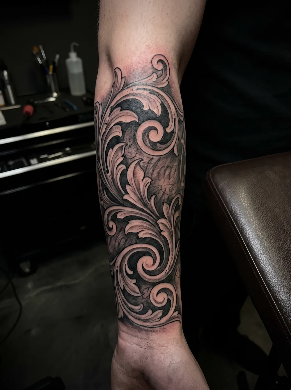
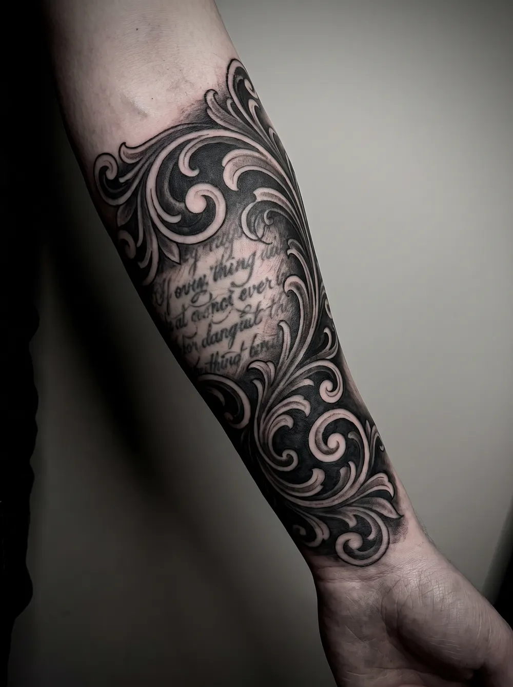
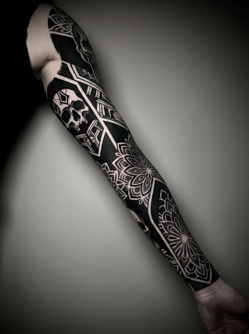
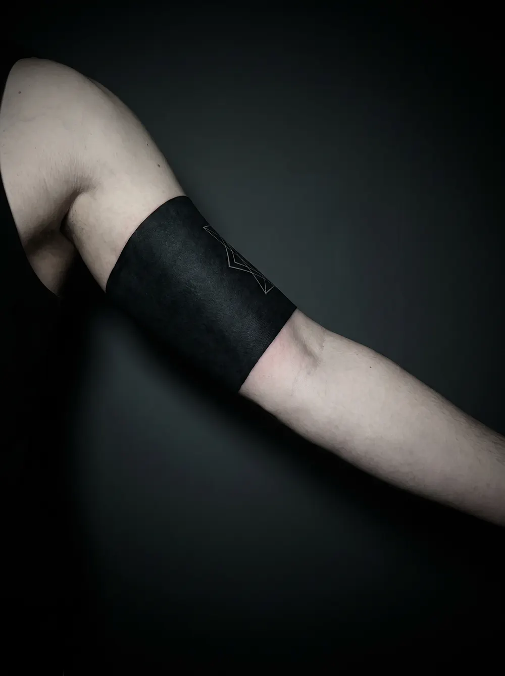
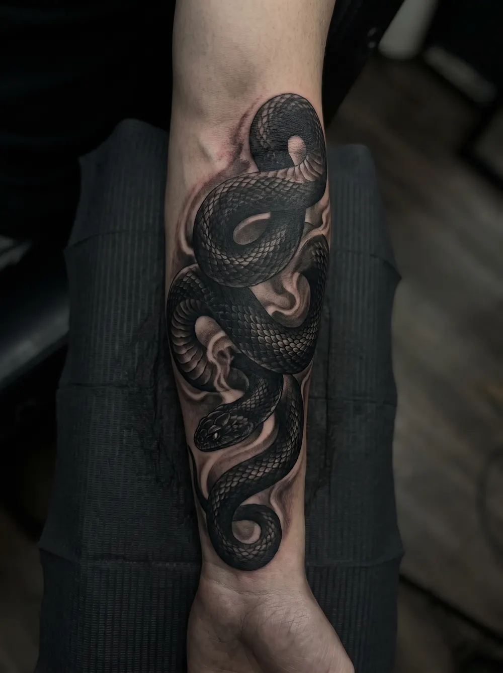
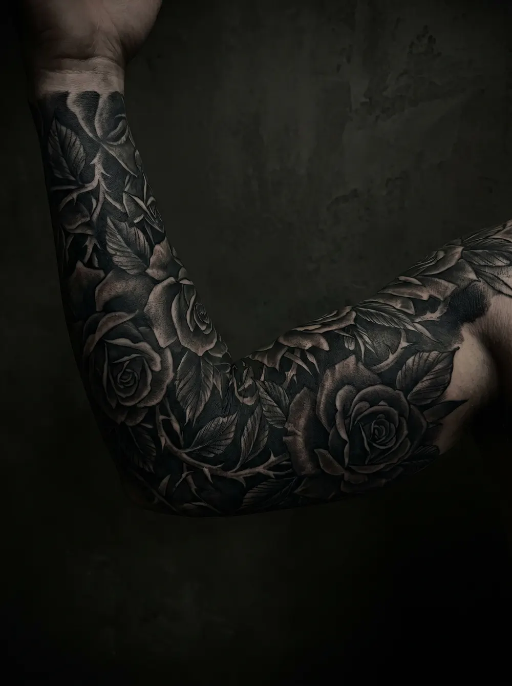
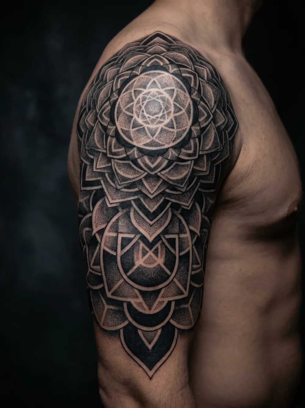
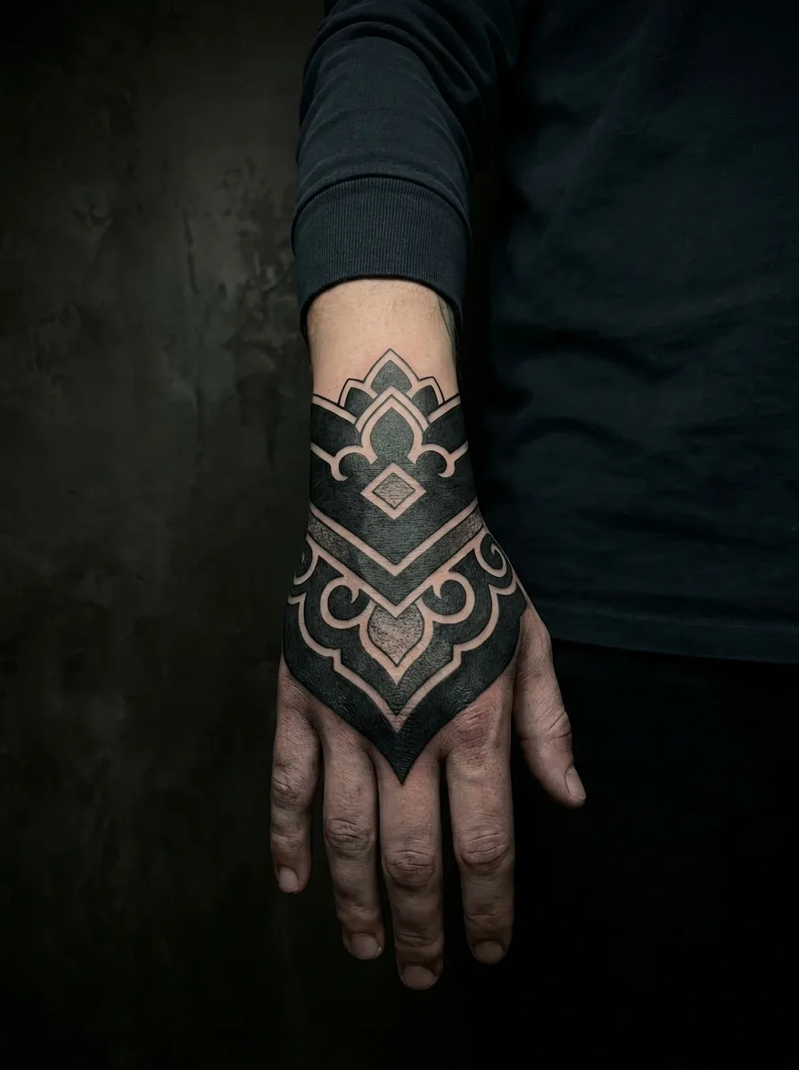
Design inspiration, including AI-generated concepts; these images do not document healed cover-up results. A photo preview cannot confirm how new ink will cover an existing tattoo.
How it works
Aim at legibility, not darkness
Text is readable from fragments. The design has to cross and break the letter shapes — partial coverage that only darkens them leaves the word intact.
Match the route to the text
A single initial needs a small dense motif. A quote needs something wider than the line. Blackletter needs scale, blackout or fading, because it is already near-solid.
Preview it over your own text
Upload a photo in the Ombra Tattoo app and check the one thing that matters — whether you can still read the words under the new design.
Pros
- Text is thin ink over mostly bare skin, so it needs less coverage than a solid image
- A single initial is one of the easiest cover-ups there is
- Ornamental and floral work hides script without going fully black
- A preview answers the only real question: can you still read it?
Cons
- Fine-line designs make it worse — they add lines to a thing made of lines
- Blackletter and gothic text behave like tribal: density is not available
- Long quotes force a piece wider than most people expect
- Partial coverage is the classic failure — a word stays readable at 80% hidden
FAQ
Can you cover up a word or lettering tattoo?
Usually yes, and more easily than a solid image, because text is thin ink over mostly bare skin. The catch is that covering text means destroying legibility rather than just darkening it — your eye rebuilds letters from fragments, so a design has to cross and break the strokes. Ornamental scrollwork, florals, snakes and dotwork all do that. Fine-line work does not.
Can you cover a word tattoo with another word?
Sometimes, and it is a common request, but it is a specialist job. The new text has to be bolder and set at a different angle, otherwise the two sets of strokes sit parallel and both stay readable. Most artists will suggest an ornamental element behind or through the new lettering to break the old shapes. Preview it before committing — this is the case where partial coverage is easiest to get wrong.
Are blackletter or gothic letters harder to cover?
Considerably. Blackletter is thick and near-solid, so it behaves like tribal rather than like script: you cannot out-darken it. The honest routes are a much larger piece whose own dark areas absorb it, a deliberate blackout, or a session of laser fading first. A normal ornamental cover-up sized for thin script will not hide it.
Ombra Tattoo
Preview ink on your own skin